

Role:
Product Designer
Team
Product
Key Results
Transformed chaos into structured data
Designed end-to-end facilitation flow
Bridged ideation and execution
Qmarkets
Qmarkets is a B2B SaaS platform optimizing the corporate innovation lifecycle. To tackle low user participation, we developed the Innovation Whiteboard built from scratch. Unlike standard canvases, this tool guides teams through a structured, gamified workflow to drive rapid results. As a Product Designer, I led the end-to-end process from conceptual logic to final UI, creating a system that ensures every session concludes with 5 actionable, implementation-ready ideas.
The Challenge
Boosting End-User Engagement
We needed to make participation easier and more inviting for employees across the company, ensuring they can contribute without high friction.
Delivering Actionable Results
The goal was to provide immediate value to the Innovation Manager-ensuring that every session concludes with 5 vetted ideas, ready for implementation.

The Solution Strategy
To solve the lack of focus, we moved away from the "infinite canvas" model. Instead, we designed a structured, linear workflow. The system acts as a digital facilitator, guiding the team through four distinct stages. from raw ideation to a final decision, ensuring no time is wasted on organizing the board.


Competitive Analysis
We conducted a competitive analysis of leading whiteboard tools. While platforms like Miro and Mural offer excellent free-form capabilities, they lack the structure required for enterprise innovation.
We identified Butter as a close competitor offering guided flows, yet it lacked two critical components for our needs:
Integration: No seamless sync with our core platform.
Data Structure: No ability to enforce strict templates that output standardized reports.
The Opportunity: We decided to build a tool that bridges this gap, taking the visual appeal of competitors but adding a rigid "Database" layer underneath to generate actionable reports.
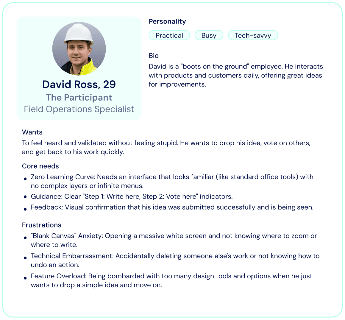
The Personas
We defined two core personas with opposing needs: The Facilitator, who requires strict structure and automated data to ensure ROI, and The Participant, a busy employee who needs a zero friction experience. The design challenge was to create a single interface that empowers the manager with control while keeping the process effortless for the end-user.

User Flow
To guarantee results, I designed a rigid flow that prevents the "blank canvas paralysis." Unlike open whiteboards, this workflow forces a linear progression. The Facilitator leads the room through 4 distinct stages: Collection, Review, Voting, and Conclusion. Ensuring that every session ends with exportable data rather than messy sticky notes.
The Facilitator’s journey


The Solution
Before diving into pixels and colors, I focused on the Information Architecture. My primary goal was to validate the complex 4-step workflow without visual distractions. I started with the wireframes to map out the hierarchy, ensuring that the Facilitator has easy access to advanced controls while keeping the Participant’s view clean and focused.

Products Wireframes
The workflow begins with the Facilitator configuring the session. While they start with a structured template (like SWOT), the real power lies in the customization.
We designed a Stage Manager that allows facilitators to fine-tune every step: "Silent Mode" (hiding others' notes), timers per stage, token budgets for voting or enabling AI enrichment for idea development.
Stage #1
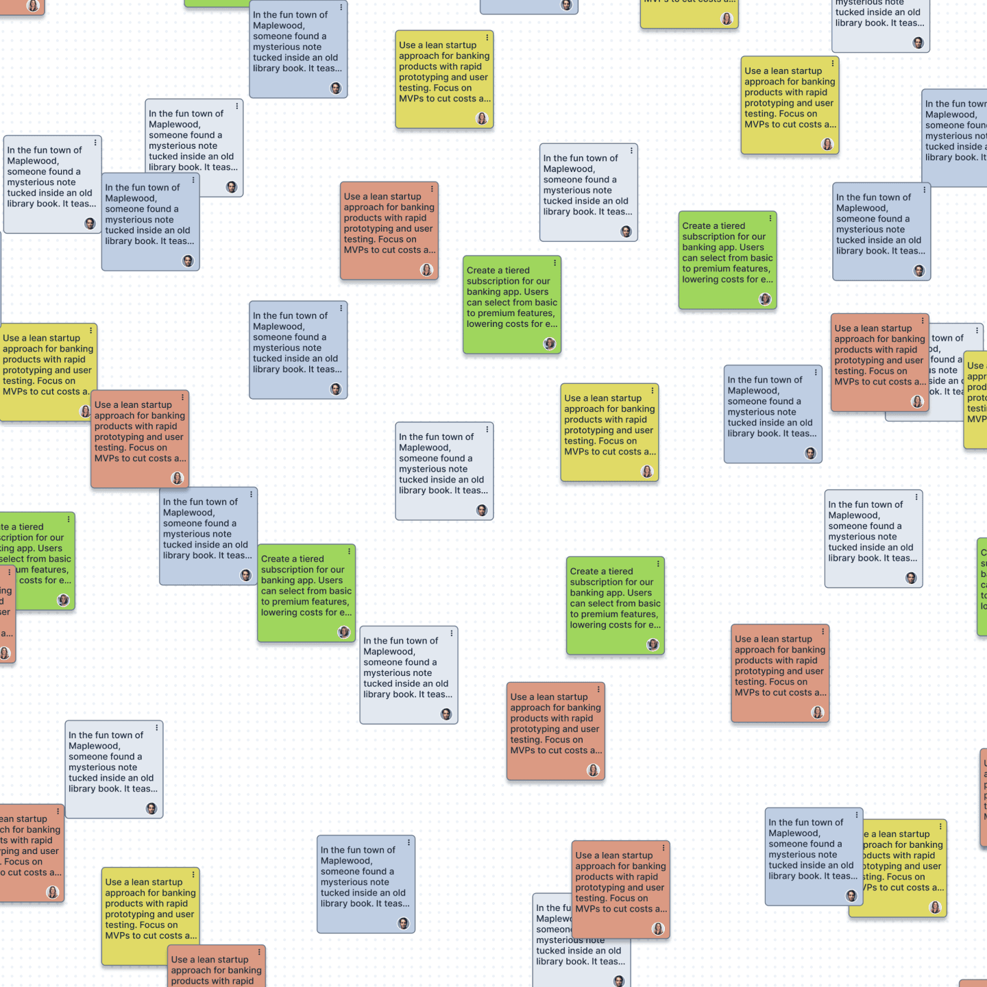
In the collection phase, the goal is to capture high-volume input while maintaining data structure.
Instead of manual tagging, the UI detects where a note is dropped (e.g., "Strengths" column) and automatically applies the correct color-coding. This ensures that ideas are categorized by the system in real-time.
Stage #2
Before moving to a vote, raw ideas must be curated into clear concepts.
Opening specific cards for discussion and adding necessary context or comments.
AI Fusion
The system identifies similar sticky notes and allows the facilitator to merge them into a single, coherent idea, eliminating redundancy.
A binary control allows the facilitator to mark ideas as "Ready for Vote" or archive irrelevant ones, ensuring the team focuses only on high-quality content.
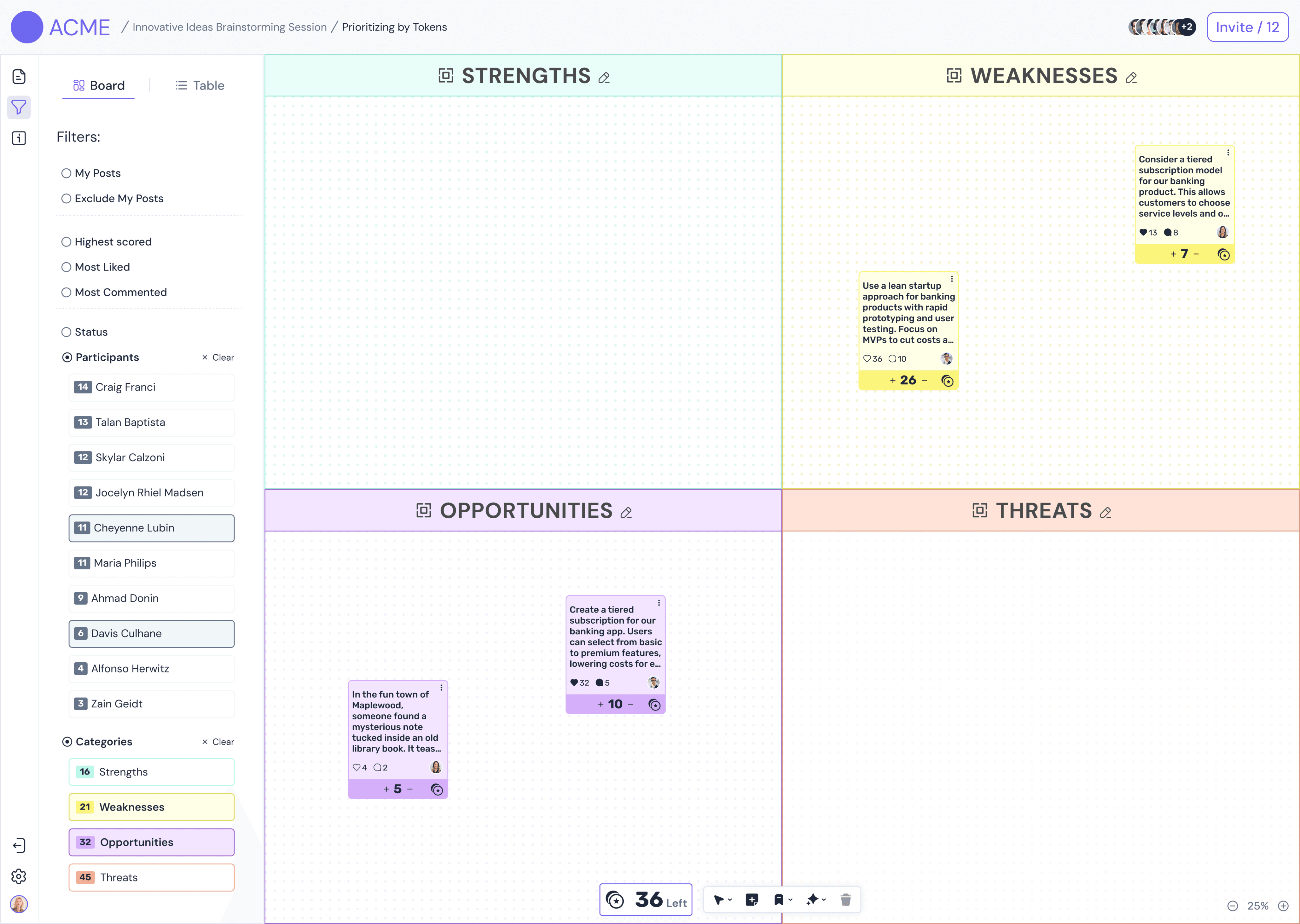
Stage #3
To identify the most valuable ideas, the system uses a token allocation method rather than standard "likes." The facilitator defines a specific token budget per participant. Users must then distribute their limited tokens among the ideas they support most. This constraint forces critical thinking and clearly surfaces the top priorities based on group consensus.
Stage #4
rated ideas. The critical differentiator of this tool is the "Export" function: with a single click, the facilitator converts the winning sticky notes into active project submissions within the main Qmarkets platform. This ensures data continuity and bridges the gap between temporary brainstorming and long-term execution.

Deep Dive
Visual boards are great for brainstorming, but they can get messy. I designed a Table View to help the facilitator manage the data better.
By switching to this view, the manager can see all the sticky notes as a clear list. It makes it much easier to read the text, sort ideas by the number of votes, and edit details without searching around the canvas.

When there are 50+ ideas on the board, it's hard to focus. I added a filtering bar to help the manager find exactly what they need.
Users can quickly filter the list by Category (like "Marketing") or Status. They can also sort the list to see the top-voted ideas at the top, helping the team focus on the best solutions.
The UI
The challenge was to create a UI that feels fun for brainstorming but serious enough for enterprise use.
Design System
I built a consistent library of components (cards, tags, controls) to ensure the interface remains scalable across different screen sizes.
Accessible Contrast
To ensure readability for all users, I strictly utilized dark typography on pastel backgrounds. This creates a high-contrast ratio that reduces eye strain and remains legible even on low-quality projectors in meeting rooms.

Conclusion
This project transformed the chaos of brainstorming into a structured, exportable workflow. By shifting from an infinite open canvas to a guided 4-step process, we proved that constraints actually boost creativity.
Dual-Persona Design
The challenge was balancing the Facilitator’s need for control with the Participant’s need for simplicity. The solution was Role-Based Adaptation: while both users share the same canvas, the interface reveals advanced management tools only to the Facilitator, keeping the Participant’s view clean and focused.
Data-First Thinking
A pretty interface isn't enough. Designing the "backend logic" of the sticky notes (categories, tags, voting scores) was crucial for making the final export feature truly valuable for the business.